Architecture
This document describes the runtime and logical architecture of FT Configs UI, its main building blocks, and interaction patterns with backend services.
C4 Context
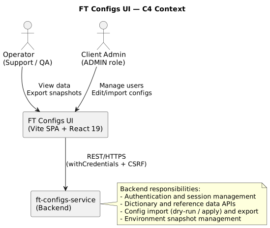
| Email delivery for first-login temporary passwords is handled by the backend (confirmed by project owner). |
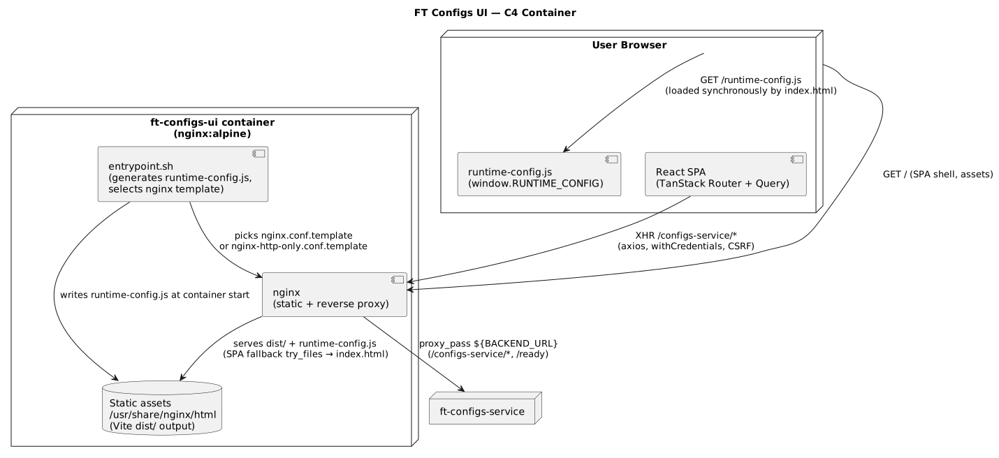
The container diagram below shows how the browser, the single nginx container, and the backend cooperate at runtime.
Client-side Architecture
The application runs entirely in the browser. There is no Node.js process in production — nginx serves static files and proxies API calls. The client is organised in four layers:
-
Bootstrap.
index.htmlloads/runtime-config.jssynchronously before the app bundle, populatingwindow.RUNTIME_CONFIG.src/main.tsxmounts<App />into#root. -
Providers.
Appwraps the tree in, from outermost to innermost:I18nProvider→QueryProvider→AuthProvider→TooltipProvider(app-level,delayDuration=200,skipDelayDuration=300) →RouterProvider+<Toaster />.AdminRolesProvideris attached lazily insidesrc/routes/_protected/settings/_admin.tsx, not globally. -
Routing. TanStack Router (file-based) drives the view tree. Routes live under
src/routes/**, and@tanstack/router-plugingeneratesrouteTree.gen.ts. Layout routes_auth.tsx(public) and_protected.tsx(authenticated) group sibling pages. -
Data access. Feature components call typed services in
src/api/<module>/which go through the shared axios instance insrc/lib/axios.ts. Server state is cached by TanStack Query (staleTime: 30s,gcTime: 5m,retry: 1,refetchOnWindowFocus: false).
The axios instance handles:
-
base-URL resolution via
resolveApiUrl()(readswindow.RUNTIME_CONFIG.API_URL, falls back to/configs-service); -
per-request locale header from the
localecookie; -
CSRF token fetch for unsafe methods, with concurrent requests deduplicated via a shared
csrfPromise; -
401 refresh-token retry flow guarded by a
_retryflag to avoid infinite loops; -
read-only enforcement (see below).
Major subsystems
-
Routing (TanStack Router, file-based). Routes live in
src/routes/**. The root route sets up<Suspense>with aFullPageSpinnerfallback. Layout routes:-
_auth.tsx— public pages (login, register, change-password). -
_protected.tsx— component-level auth guard usinguseAuth(): if!isAuthenticated && !isLoadingit navigates to/loginwithreplace: true. Disabled route prefixes are redirected to/. -
_protected/settings/_admin.tsx— wraps admin pages inAdminSettingsGuardand attachesAdminRolesProvider.The auth guard is implemented in a component, not in beforeLoad.beforeLoadruns outside React context with a frozen snapshot and cannot wait forAuthProviderupdates, so a standard React-context guard is used instead.
-
-
Providers:
-
I18nProvider(src/contexts/i18n-provider.tsx) — staticen.json/ru.jsondictionaries, locale detected fromlocalecookie →navigator.language→'en', plural + interpolation support, syncsdocument.documentElement.lang. -
QueryProvider(src/providers/query-provider.tsx) — singletonbrowserQueryClient+ React Query Devtools. -
AuthProvider(src/contexts/auth-provider.tsx) — session state (user,isAuthenticated,isLoading, computedisReadOnly),refreshSession()on mount, best-effort logout, swallows 401 fromgetSession(). -
AdminRolesProvider(lazy, only in_admin.tsx) — caches admin roles with a module-level promise for request deduplication. -
Global
Toaster(shadcn/ui) — centralised user notifications.
-
-
API layer:
-
Shared axios instance (
src/lib/axios.ts) — the full CSRF / 401 / read-only behaviour described above. -
Typed services (
src/api/<module>/) — one directory per feature area (acs,angular,provision-portal,settings,northbound.ts,service-api.ts). -
High-level API wrappers (
src/lib/api.ts) — login, logout, session, profile, file operations.
-
-
Feature modules:
-
ACS configuration (
src/routes/_protected/acs/,src/components/acs/) — 11+ modules (bulk-data, configuration, dashboard, CTN info, external-trace, FCC config, force QoE stop, FT ACS task config, FT ACS WS access, hardcoded event, parameter-names cache, set-parameter result template). -
Angular Console (
src/routes/_protected/angular/*) — 18+ modules (app ports, columns, cube-DSL parameters, custom params, dashboard, device activities, device monitoring, frames, interface items, mesh, neighboring Wi-Fi diagnostic paths, network device param mappings, network map, replace services, RPC methods, simplified view, SNMP configuration, tab-view, tabs, user info, VoIP). -
Provision Portal (
src/routes/_protected/provision-portal/*) — 8 modules (configuration, CSV settings, custom status, objects, params, replace CPE, statuses). -
Northbound API and Service API (
_protected/northbound.tsx,_protected/service-api.tsx).
-
Component diagram (high level)
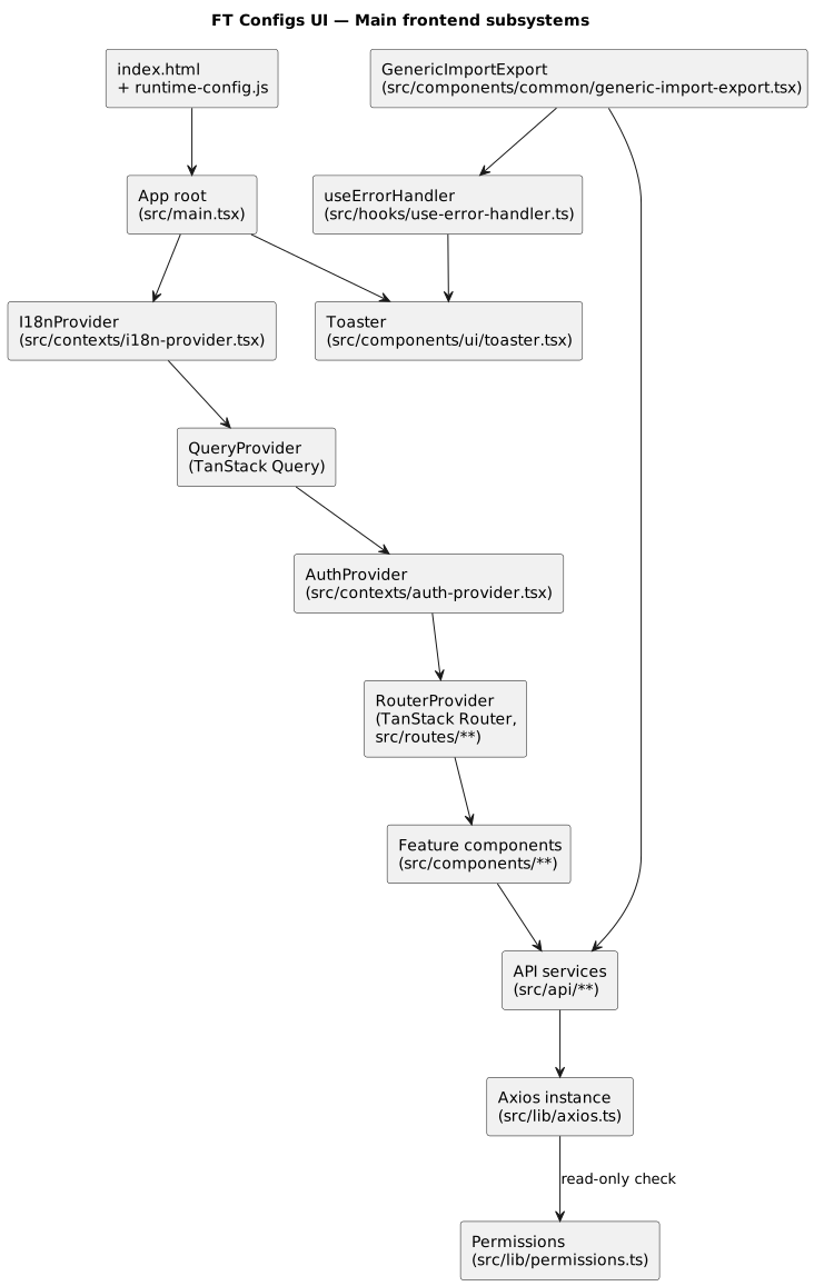
Shared components are intentionally centralized to ensure visual consistency, predictable behavior, and low duplication across feature modules.
Shared UI building blocks
The UI uses shadcn/Radix primitives (src/components/ui/) and shared feature components under src/components/. GenericImportExport (src/components/common/generic-import-export.tsx) implements the common dry-run-then-apply import flow used by most dictionary pages:
-
Call the dry-run endpoint and render its
ok/errors/warnings/summarypreview. -
Block the Apply import button until the dry-run succeeds.
-
On apply, post the file (optionally with
allowWarnings) and refresh the table. -
Export downloads a file via a blob response.
Each feature page configures this component through a *-import-export-config.tsx file next to it.
State model (operator capabilities)
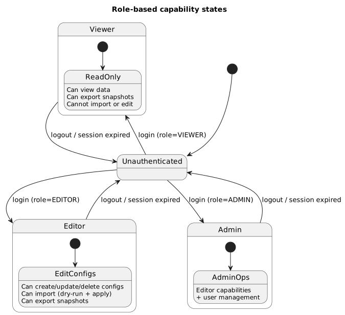
The state model below illustrates how user roles map to effective capabilities enforced in the UI.
Read-Only Mode (multi-layer enforcement)
Read-only mode for VIEWER users is enforced in three places:
-
Axios request interceptor —
shouldBlockRequestForReadOnly(method, url)insrc/lib/permissions.tsrejects unsafe HTTP methods (POST,PUT,PATCH,DELETE) unless the URL matches an allow-listed prefix (e.g./auth/*,/service-api/import/dry-run). -
AuthProvider — exposes a computed
isReadOnly = user.role === 'VIEWER'flag. -
UI props — route components pass
isReadOnlyinto feature components, which disable or hide write actions accordingly.
This layered approach guarantees that even if a UI element is accidentally left enabled, the axios interceptor still blocks the request before it reaches the backend.
When adding new write endpoints, ensure they are covered by the read-only blocking rules in src/lib/permissions.ts.
|
Error handling convention
All feature code uses useErrorHandler().handleError(error, options) from src/hooks/use-error-handler.ts. It normalises server, network, validation, and frontend errors into a UnifiedError (see src/lib/error-utils.ts), shows a localised toast, and logs a grouped diagnostic message. A silent mode is available for background refreshes.
| Architectural changes that affect authentication, routing, or runtime configuration should be reflected both in this document and in the corresponding C4 diagrams to keep them aligned. |
App Provider Stack
The root App component (src/app.tsx) wraps the entire React tree in a strictly defined provider chain. The nesting order is critical — each subsequent provider may use the context of the ones above it:
I18nProvider                          ← outermost: translation available to all
  └─ QueryProvider                    ← TanStack Query (cache, devtools)
      └─ AuthProvider                 ← session, user, isReadOnly
          └─ TooltipProvider          ← app-level, delayDuration=200, skipDelayDuration=300
              ├─ RouterProvider        ← TanStack Router (file-based routes)
              └─ Toaster              ← global notifications (shadcn/ui)
TooltipProvider is set at the application level with delayDuration={200} and skipDelayDuration={300}, which provides consistent tooltip behavior: a 200 ms delay before showing and a 300 ms "fast mode" when hovering over several elements in sequence. Individual components (sidebar, feature pages) may override these values with a local <TooltipProvider> when needed.
AdminRolesProvider is not part of the global stack — it is attached lazily inside src/routes/_protected/settings/_admin.tsx, wrapping only the administrative pages.
|
Settings Module Architecture
The settings module (/settings/*) implements the management panel for accounts, the profile, and the audit log. Navigation within the module is built on tabs (SettingsTabs), and access to administrative sections is protected by a guard.
Tabs and Navigation
The SettingsTabs component (src/components/settings/settings-tabs.tsx) renders three tabs:
| Tab | Route | Access | Description |
|---|---|---|---|
Profile |
|
All roles |
View and edit your own profile |
Users |
|
ADMIN only |
Manage system users |
Audit Log |
|
ADMIN only |
Audit log with filtering and export |
Tab filtering by role is performed on the client side: the tab array contains an adminOnly flag, and the filter() method hides administrative tabs from non-administrators.
Protecting Administrative Routes
The AdminSettingsGuard component (src/components/settings/admin-settings-guard.tsx) implements a render-time check of the user’s role:
-
While the session is loading (
isLoading) — it shows a loading indicator. -
If the role is not
ADMIN— an instant redirect via<Navigate to={APP_ROUTES.SETTINGS_PROFILE} replace />. -
If
ADMIN— it renders the child components.
This approach uses the <Navigate> component instead of the router’s beforeLoad hook, because the guard requires access to the AuthProvider React context.
UserDetailsModal
The UserDetailsModal modal (src/components/settings/user-details-modal.tsx) shows user details in a single vertical flow (without inner tabs):
-
Core information — a form with the username, email, role, and enabled fields.
-
Sessions — a collapsible section (
Collapsible) with the list of the user’s active sessions. -
Danger zone — a bottom block with destructive actions (deleting the user), visually separated from the main content.
Audit Log Detail: a Route, Not a Dialog
The detailed view of an audit event is implemented as a separate route /settings/audit-log/:eventId (file src/routes/_protected/settings/_admin/audit-log/$eventId.tsx) rather than as a modal. This provides:
-
Deep-linking — a direct link to a specific audit event.
-
Filter context preservation — when navigating to the details, the current filters are passed in the URL search params, which lets the Back button restore the list state.
-
Navigation between events — the detail page supports moving to the previous/next event (
prevId/nextId).
Row-Level Actions
The users table (src/components/settings/users-table.tsx) uses the DropdownMenu pattern for row actions. Each row contains a trigger button with a dropdown menu that includes:
-
Editing the user
-
Enabling/disabling the account (toggle with optimistic UI)
-
Deleting (visually separated by
DropdownMenuSeparator)
Optimistic UI for toggle operations means the UI updates immediately on click and, on a server error, rolls back to the previous state.
Audit Log API Contract
The audit log module communicates with the backend through src/api/settings/audit-log.ts. The API uses the Accept-Language header to localize metadata.
Entity types
The /api/admin/audit-log/entity-types endpoint returns an array of AuditEntityTypeMeta objects:
interface AuditEntityTypeMeta {
    code: string;             // unique entity-type code
    group: string;            // grouping (e.g., "settings", "acs")
    label: string;            // localized label (via Accept-Language)
    icon: string;             // icon name for display in the UI
    supportsSnapshot: boolean; // whether the entity supports state snapshots
    supportsDiff: boolean;     // whether the entity supports change comparison
}
The supportsSnapshot and supportsDiff flags determine which tabs are available on the event detail page: "Changes" (diff) and/or "Snapshot" (full before/after snapshot).
Operations
The /api/admin/audit-log/operations endpoint returns an array of AuditOperationMeta:
interface AuditOperationMeta {
    code: AuditOperation;             // operation code (CREATE, UPDATE, DELETE, ...)
    label: string;                    // localized label
    severity: 'LOW' | 'MEDIUM' | 'HIGH'; // severity level
    destructive: boolean;             // destructive operation (visually highlighted)
}
The severity and destructive fields drive the dynamic styling of badges in the table and on the detail page: destructive operations are shown in --destructive colors, and high severity gets an accented background.
Summary DTO
The AuditEventSummary object includes the actor, target, and previewChanges fields:
interface AuditEventSummary {
    id: number;
    occurredAt: string;
    operation: AuditOperation;
    username: string;
    entityType: string;
    entityId: string;
    context: string;
    changeReason: string | null;
    transactionId: string | null;
    actor?: AuditActorDto;          // who performed the action
    target?: AuditTargetDto;        // what the action was performed on
    previewChanges?: AuditFieldChange[] | null; // change preview for the list
}
The previewChanges field makes it possible to show a brief overview of the changes directly in the table row, without opening the detailed view.
CSV export
The export endpoint returns a Blob with a CSV file. The filter parameters (operation, entityType, username, from, to) are passed via query params. The client code creates a temporary <a> element to download the blob:
const blob = await auditLogApi.exportCsv({
    operation: [...],
    entityType: "...",
    username: "...",
    from: "...",
    to: "...",
});
The page, size, and sort parameters are not sent on export — the CSV contains all records matching the filters.
|
Design System Tokens
The FT Configs UI design system is built on CSS custom properties and Tailwind utilities. All visual values are extracted into tokens, which guarantees consistency and support for light/dark themes.
Color
All colors are defined through CSS custom properties in src/styles/globals.css:
:root {
    --primary: 208.8 60% 42.2%;
    --destructive: 4.1 89.6% 58.4%;
    --muted: 0 0% 93.3%;
    --border: 0 0% 82.4%;
    /* ... */
}
.dark {
    --primary: 208.8 60% 42.2%;
    --destructive: 4.1 89.6% 58.4%;
    /* ... */
}
Hardcoded colors are not allowed in the project. All color values must reference CSS custom properties through Tailwind classes (text-primary, bg-destructive, etc.) or via hsl(var(--token)).
|
Additional semantic tokens for status badges:
| Token | Purpose |
|---|---|
|
Successful operations, active states |
|
Warnings, pending actions |
|
Errors, destructive operations |
|
Informational badges, neutral states |
Each status token has three variants: -bg, -text, -border.
Border Radii
The project follows uniform corner-rounding rules:
| Element | Tailwind class | Token/value |
|---|---|---|
Cards (Card) |
|
0.75rem |
Dialogs (Dialog) |
|
0.75rem |
Controls (Button, Input, Select) |
|
0.5rem (base |
Animation and Motion
The project defines two custom easing tokens in :root:
--ease-out: cubic-bezier(0.23, 1, 0.32, 1);     /* entering animations */
--ease-in-out: cubic-bezier(0.77, 0, 0.175, 1);  /* on-screen movement */
The main animation patterns:
-
View Transitions API — native crossfade on navigation (Chrome, Edge, Firefox 129+, Safari 18+). The old page fades out over 220 ms, the new one rises over 420 ms.
-
dashboard-rise — content enters from below (translateY 14px + scale 0.995) on route transitions.
-
welcome-pulse — a one-time pulse for the welcome state.
The global @media (prefers-reduced-motion: reduce) rule zeroes out all animations and transitions. This ensures compliance with WCAG 2.1 success criterion 2.3.3.
|
Popover / Select / Tooltip
Radix UI-based components (Popover, Select, Tooltip) use Radix CSS variables (--radix-popper-transform-origin and similar) for correct transform-origin positioning. This produces open animations that grow from a point anchored to the trigger.
Buttons: Press Feedback
All buttons in the project include active:scale-[0.97] — a slight scale-down on press that creates a tactile effect:
// src/components/ui/button.tsx — base buttonVariants styles
"... transition-[color,background-color,border-color,box-shadow,transform]
     duration-150 ease-[cubic-bezier(0.23,1,0.32,1)]
     active:scale-[0.97] ..."
The transition includes transform in the list of animated properties, and uses the same custom easing cubic-bezier(0.23, 1, 0.32, 1).
Font Strategy
The project’s font strategy is optimized for fast rendering without visual jumps (FOUT — Flash of Unstyled Text).
Body text: system stack
Body text uses the system font stack defined in src/styles/globals.css:
body {
    font-family: ui-sans-serif, system-ui, -apple-system,
                 "Segoe UI", "Inter", "Helvetica Neue", Arial, sans-serif;
}| OS | Font used |
|---|---|
macOS / iOS |
SF Pro (via |
Windows |
Segoe UI |
Linux (GNOME) |
Cantarell (via |
Fallback |
Inter → Helvetica Neue → Arial |
The system stack requires no web-font loading for body text, which ensures zero FOUT and instant text rendering.
Headlines: Space Grotesk
For headlines, the Space Grotesk font is available, loaded via @font-face with font-display: swap. The font files are hosted locally in /fonts/ (WOFF2 format). The font-headline Tailwind utility applies it:
// tailwind.config.ts
fontFamily: {
    headline: ['var(--font-space-grotesk)', 'Space Grotesk', 'sans-serif'],
}
<!-- Usage in components -->
<h1 class="font-headline text-3xl font-semibold tracking-tight">...</h1>Space Grotesk is used on the authentication pages, in hero-section headings, and other accent elements. Weights 400, 500, 600, and 700 are loaded.
When adding new headings, use font-headline only for large accent elements. Regular headings within content should use the system stack (the default).
|